Atelier Vosloo All work

Creating a global, transformative health brand.

Agency

VCCP

Sector

Healthcare

Scope

Strategy Naming Brand identity Brand world Digital

Awards

Marcom Platinum Award — Brand Identity 2022 Marcom Platinum Award — Website in the Financial Sector 2022 Creative Pool Corporate Identity Finalist (In book) 2022

Live

oonahealth.com

A strategic narrative developed around ‘Reimaging healthcare for the world’ More simply, Healthcare restored, renewed, reimagined. Allowing you to ’live better, quicker’. This strategy helped the business focus on connecting people with the right care. An innovative combination of digital, data and healthcare expertise.

The OONA wordmark takes advantage of the double ‘OO’ to amplify the “OO” sound. We chose the word for its phonetics and spoken sound. But it’s also our answer to the OODA loop, with “navigate” referencing the way we help users seamlessly navigate the complexities of the healthcare system.

At the heart of the identity is the concept of ‘microscopic analyses and the highly personalised codes hidden in DNA. We all have a unique pattern or biometric that is personal to us. The complete wordmark a graphic code representing our unique DNA / fingerprint. A wordmark that asks the viewer to decode and decipher. Some of the key considerations were for the identity to retain a personal, human feel, at home globally but proud of its Danish roots. The simplicity of shapes perfectly translates across multiple platforms and is not constrained by format.

A bold wordmark with global appeal. Built on Danish simplicity.
The Oona Health logo in white on brand blue: four shapes — circle, circle, arch and triangle — spelling OONA, with OONA HEALTH letterspaced beneath
White text on brand blue: “Oona are a health insurance provider that uses an innovative combination of digital, data and healthcare expertise to provide people with the care they need, when they need it.”
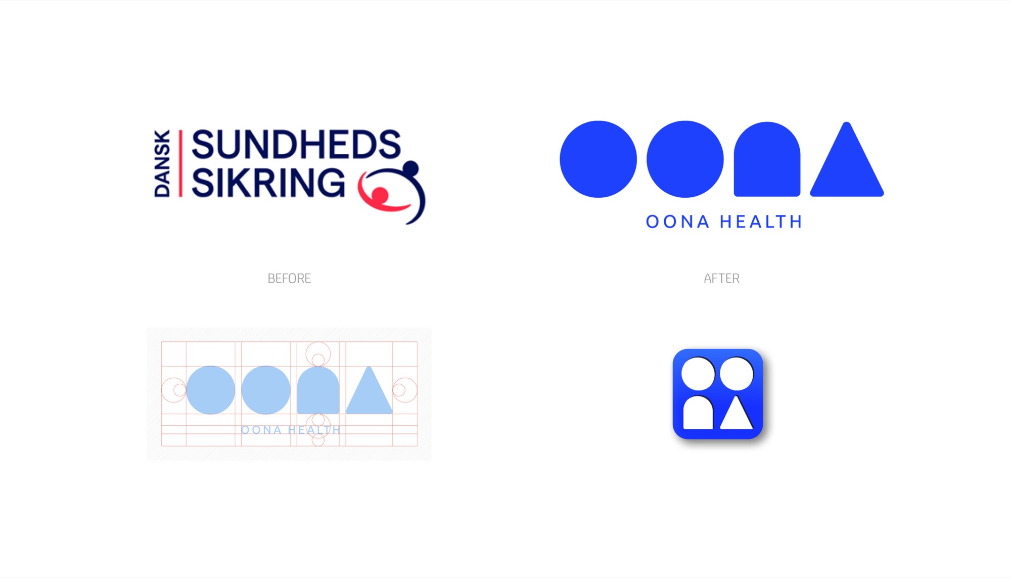
Before and after: the old Dansk Sundhedssikring logotype with its red and navy figure mark, beside the new OONA shape wordmark, with the construction grid and the blue app icon below
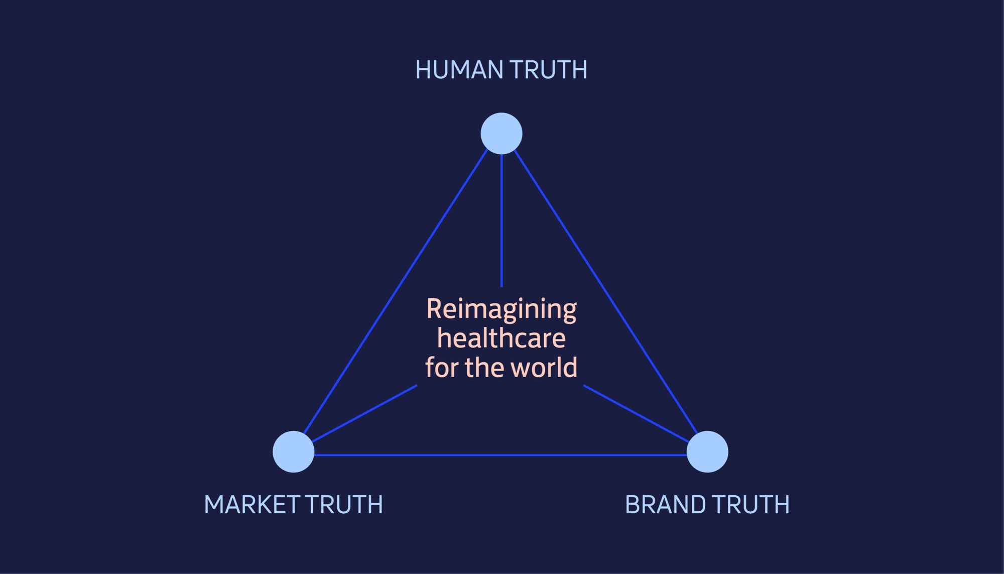
The same triangle resolved: Human, Market and Brand Truth as three dots joined by blue lines, with “Reimagining healthcare for the world” in pale pink at the centre
A slide headed The insight: “Oona are harnessing the power of personal data, to shake up the industry” — using personal data to unite disparate health insurance stakeholders into a single point of contact
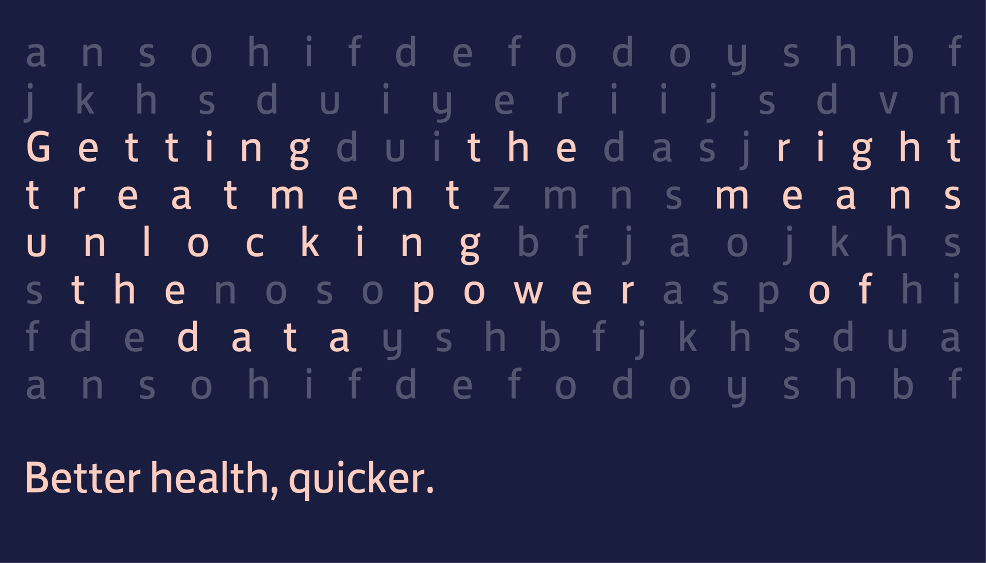
A word-search grid on navy, the phrase “Getting the right treatment means unlocking the power of data” picked out in pale pink among grey letters, with “Better health, quicker.” beneath
A slide headed The idea, with the line “Better health, quicker.” large in white on brand blue
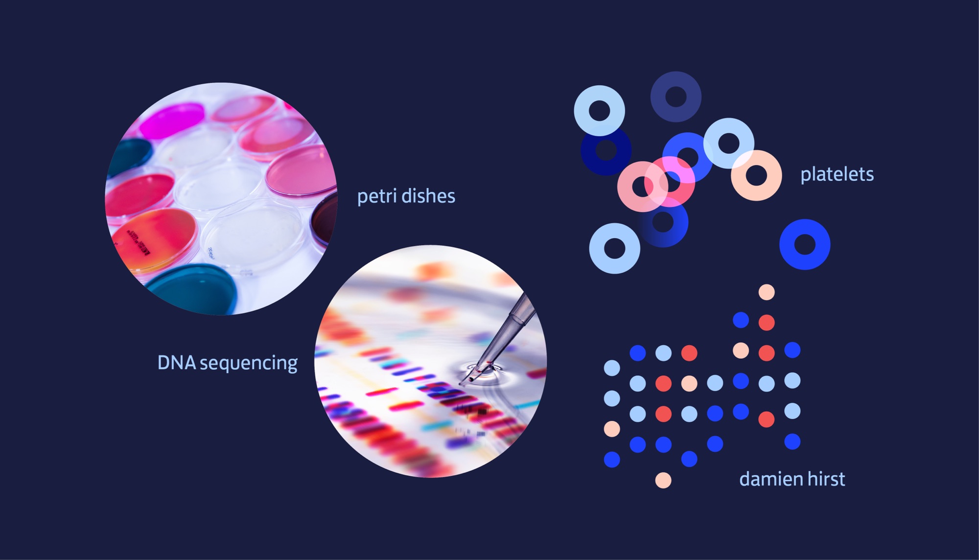
Visual reference board on navy: circular crops of coloured petri dishes and DNA sequencing, beside blue and pink rings labelled platelets and a grid of dots labelled damien hirst
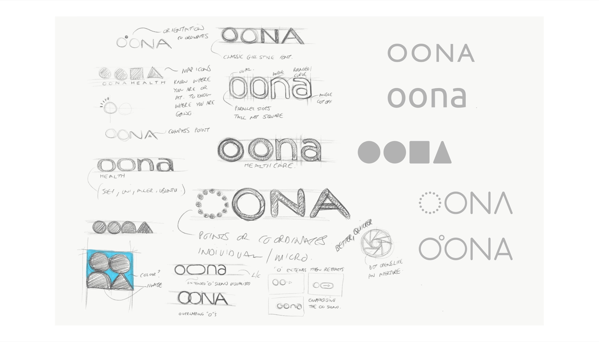
A sheet of pencil logo sketches exploring the OONA wordmark — compass points, map icons, overlapping Os, an aperture opening — annotated in handwriting, with refined digital versions down the right
A field of dots in brand blue, pale blue, red and pink arranged in loose columns on navy, the brand's data pattern
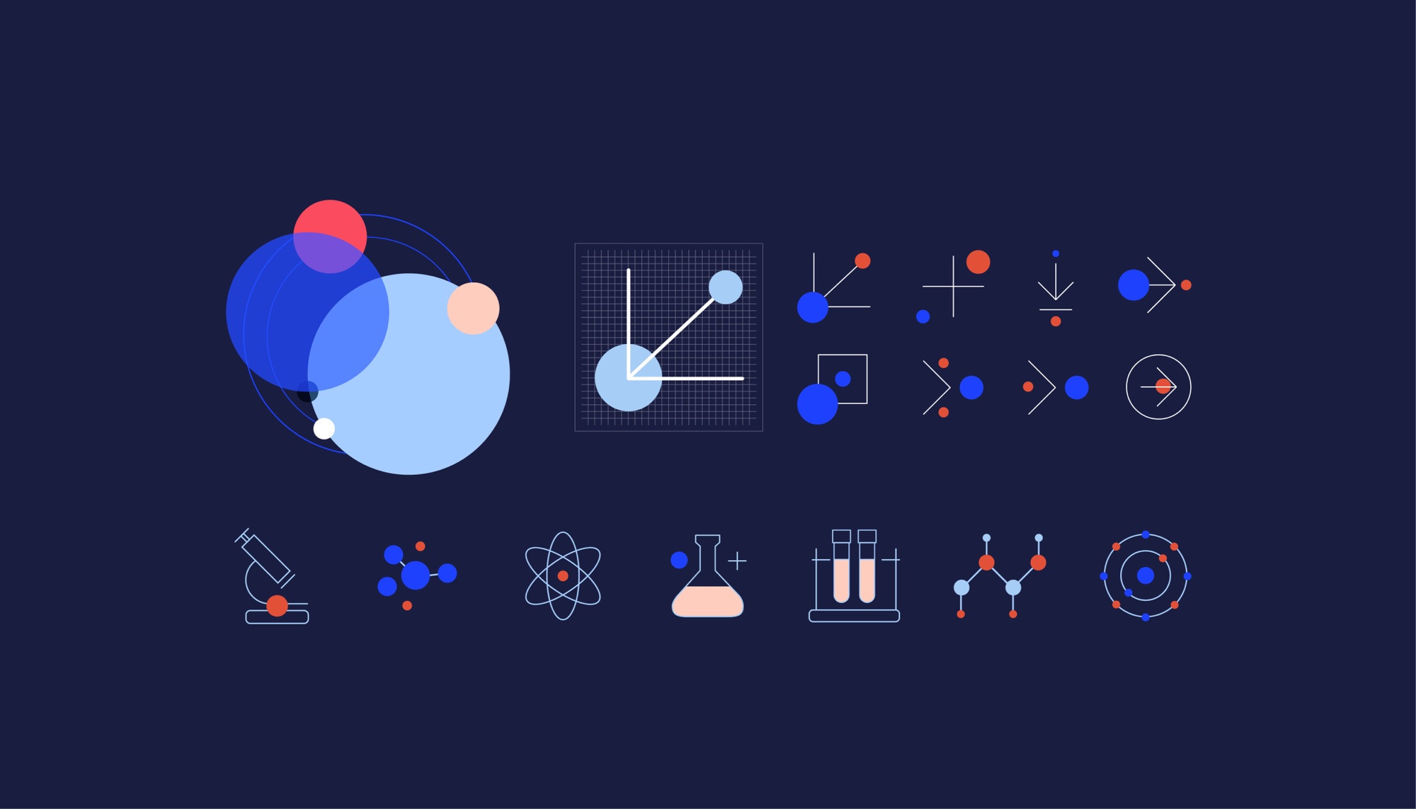
The icon system on navy: overlapping translucent circles, a plotted graph, abstract data marks, and line icons for a microscope, molecule, atom, flask, test tubes and orbit
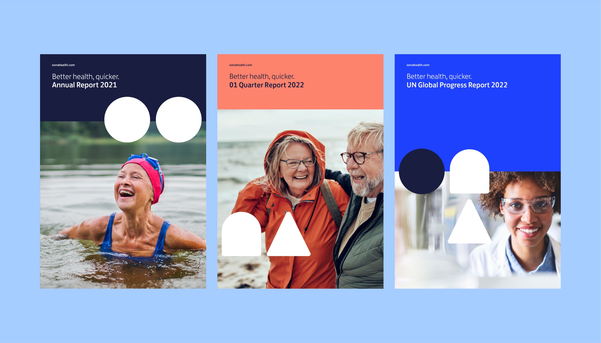
Three report covers on pale blue: Annual Report 2021 over a laughing open-water swimmer, 01 Quarter Report 2022 in coral over an older couple on a beach, and UN Global Progress Report 2022 over a lab technician
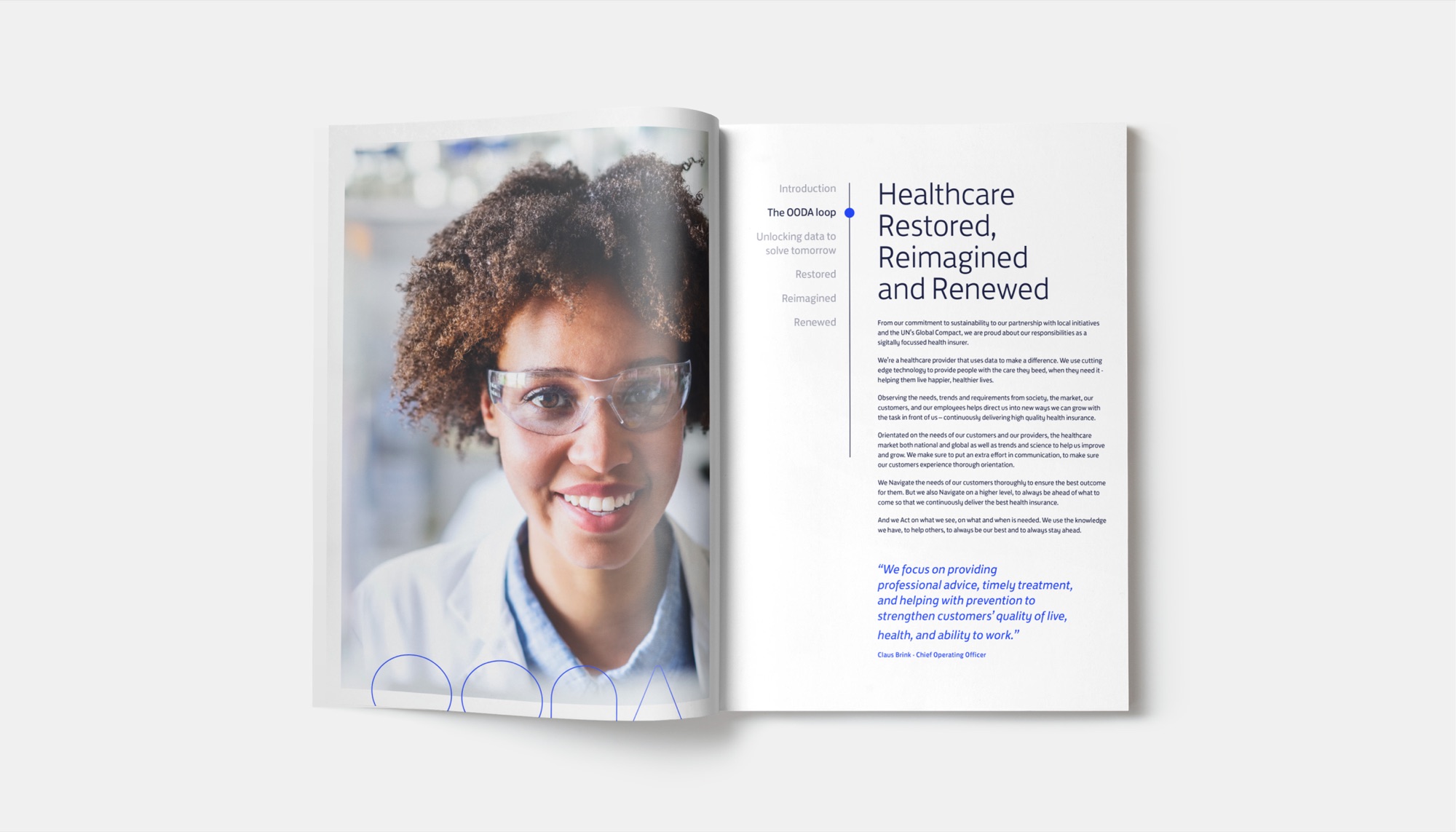
An open report spread: a full-bleed portrait of a technician in safety glasses on the left, and on the right a contents rail beside the heading “Healthcare Restored, Reimagined and Renewed” with body copy and a quote from the Chief Operating Officer
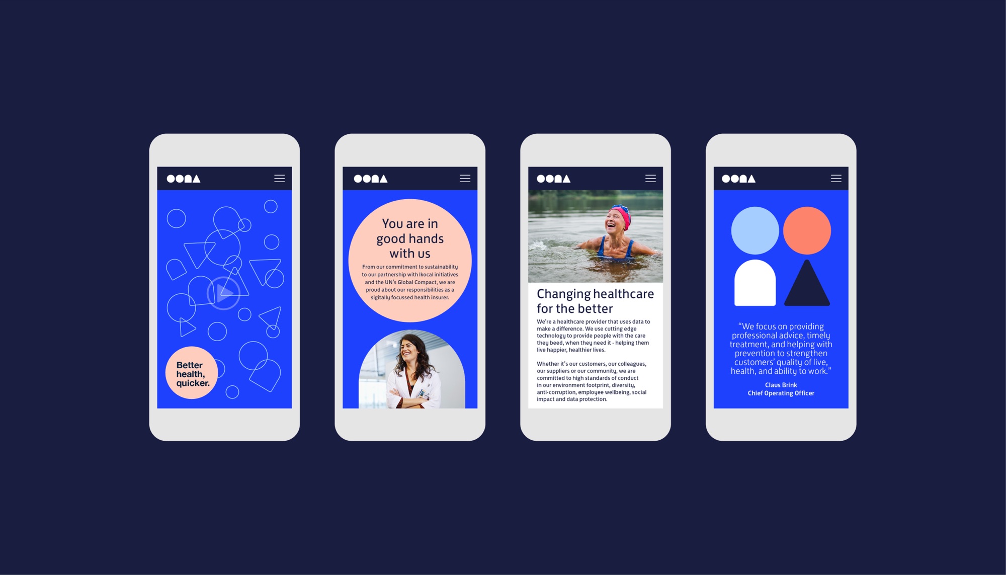
Four phone screens on navy: an outline-shape pattern with “Better health, quicker.” in a coral circle, a “You are in good hands with us” panel, an article headed “Changing healthcare for the better”, and a quote screen
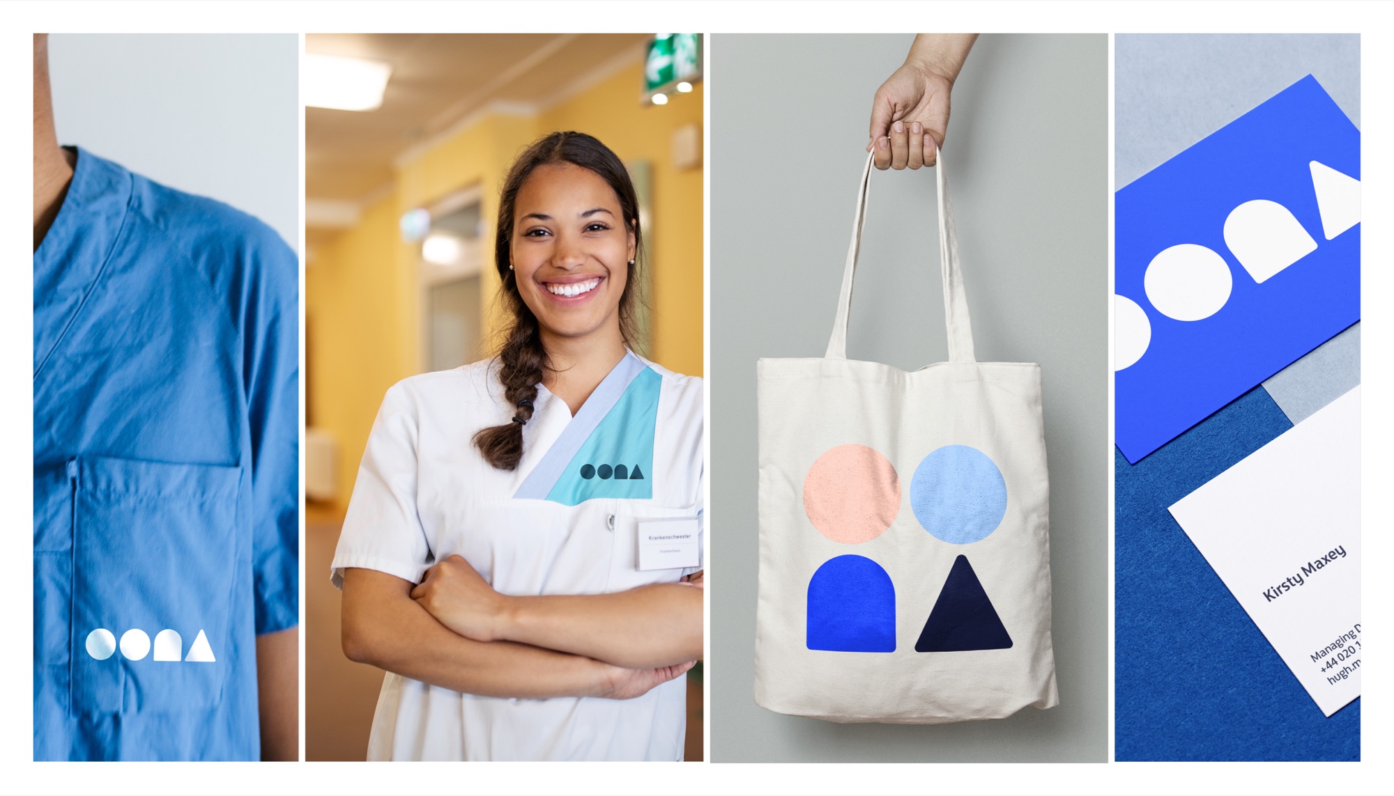
Four applications: the shape mark on blue scrubs, a nurse in a branded tunic, a canvas tote carrying the four shapes in coral, pale blue, blue and navy, and stationery with a business card
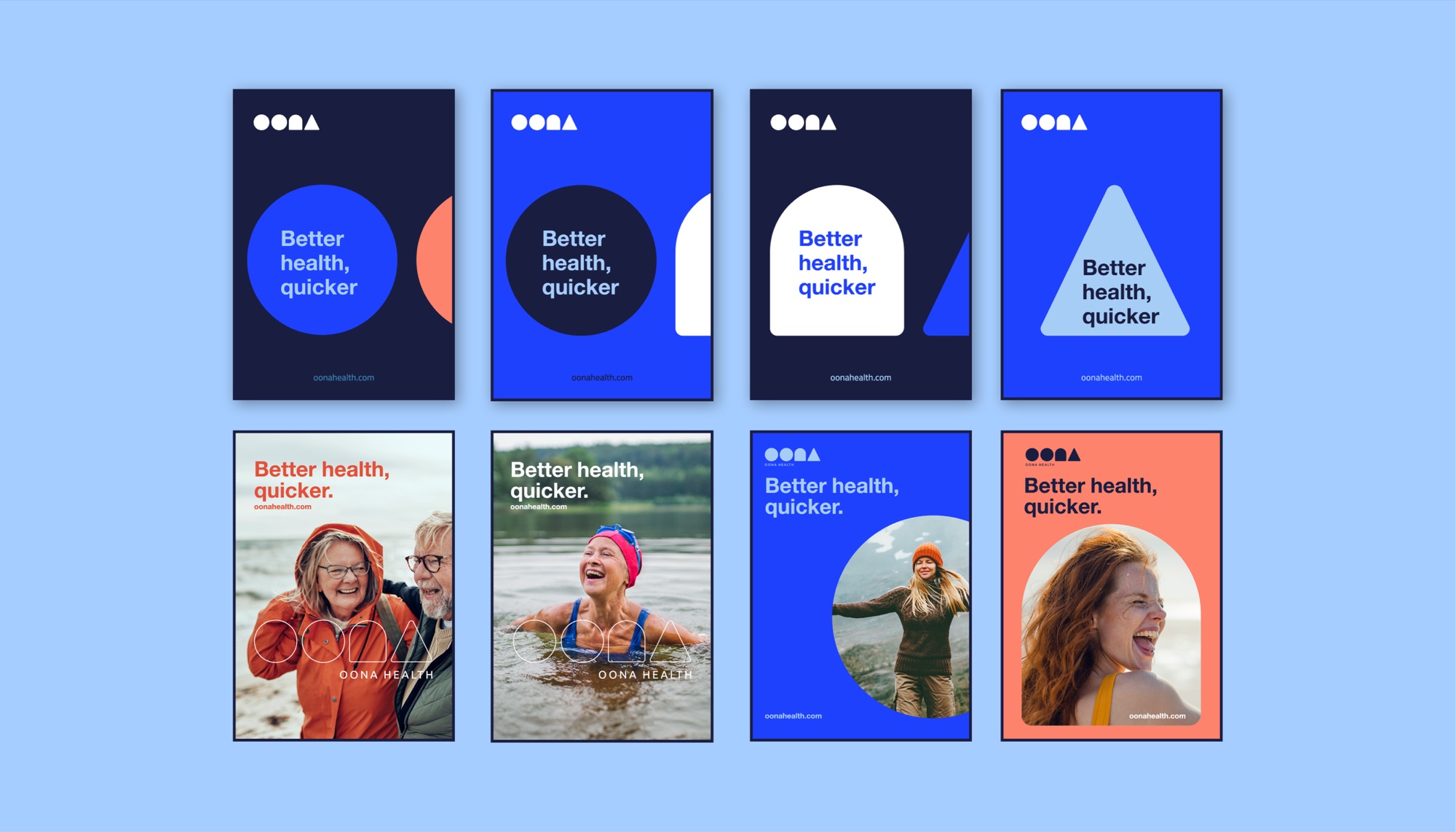
Eight posters: four typographic, with “Better health, quicker” set inside a circle, arch or triangle in blue, navy and white; and four photographic, the shape outlines overlaid on swimmers, walkers and a laughing woman
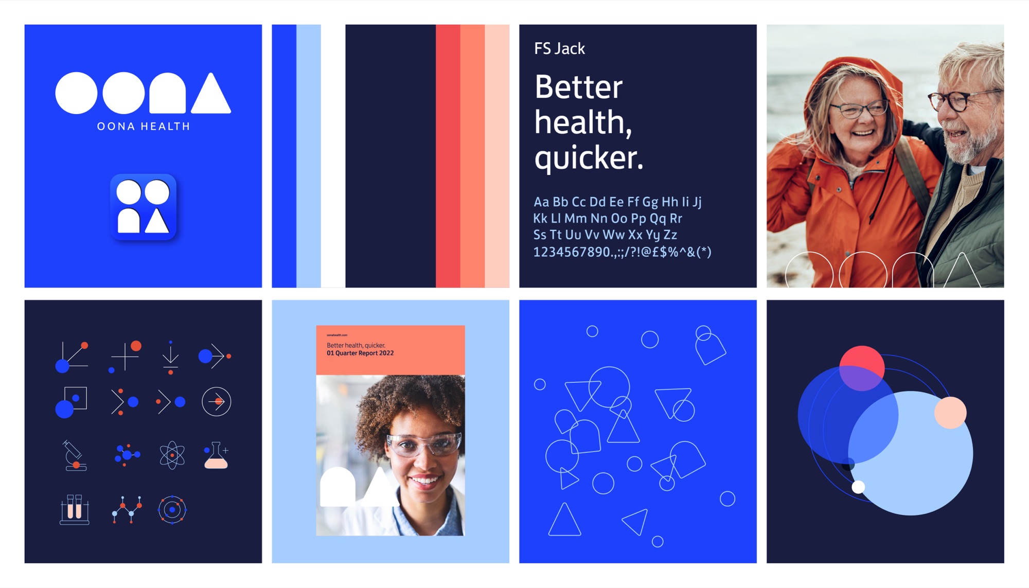
The brand system on one board: the logo and app icon, the blue, navy, red and pink palette, an FS Jack type specimen, the icon set, a report cover, the outline-shape pattern and the overlapping-circle motif
The Oona outline-shape pattern in motion: circles, arches and triangles drifting and overlapping in white line on brand blue