Atelier Vosloo All work

The largest rebrand in Africa.

Agency

FCB/Framework Design

Sector

Telecoms

Scope

Identity Strategy Visual assets Signage Retail space Presence branding Sponsorship Brand architecture Sports branding All collateral Guidelines

The Vodacom brand was stagnating and FCB was asked to carry out a brand audit. Nothing was left untouched, we travelled across the country looking at all points of contact. From the logo to print, from retail to signage, from presence to sponsorship and all the stores including 4U and the approved dealers. It was a complete overhaul.

One year later Vodacom was given a refreshed identity and brand new corporate guidelines. Then they went red…so we did it again. To align the Vodacom brand on a global stage, we partnered with FCB Africa and The Partners (UK), on the brand migration of Vodacom from blue to red. We designed a new identity, coherent with Vodafone red, to build on the equity of both brands, and worked on the ‘Red-volution’ launch campaign that doused the Johannesburg Ponte Tower in the colour red.
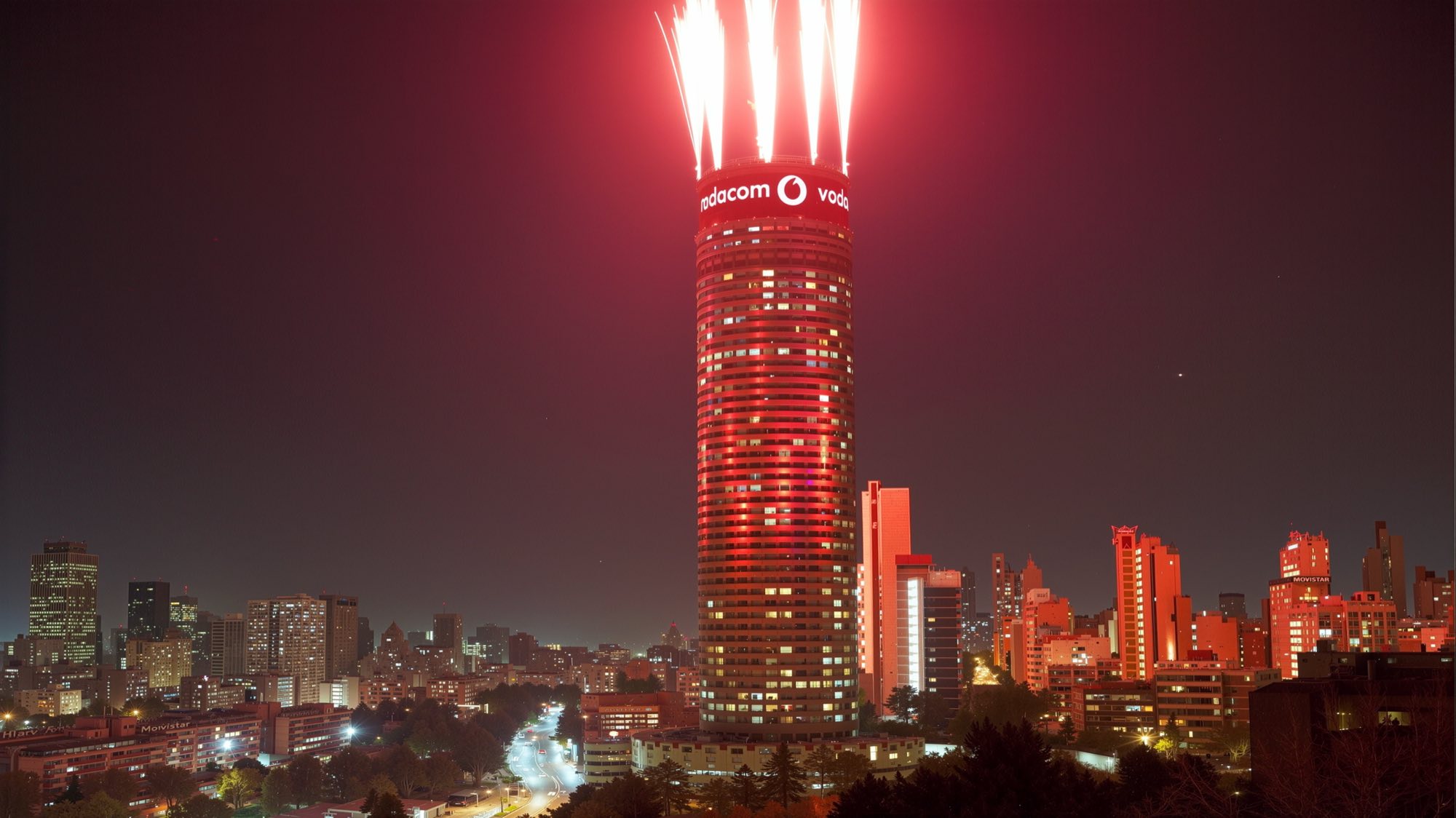
The Ponte tower in Johannesburg at night, its crown wrapped in a lit Vodacom sign with fireworks arcing from the roof above the city skyline
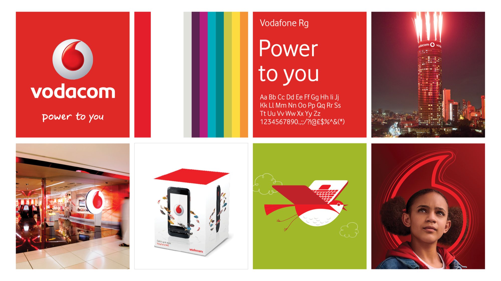
Vodacom brand summary board — the speechmark and Power to you signature on red, the colour palette, a Vodafone Rg type specimen, the branded Ponte tower, a mall storefront, handset packaging, a bird illustration on green, and a girl framed by the speechmark
The Vodacom speechmark and wordmark in white on the brand red
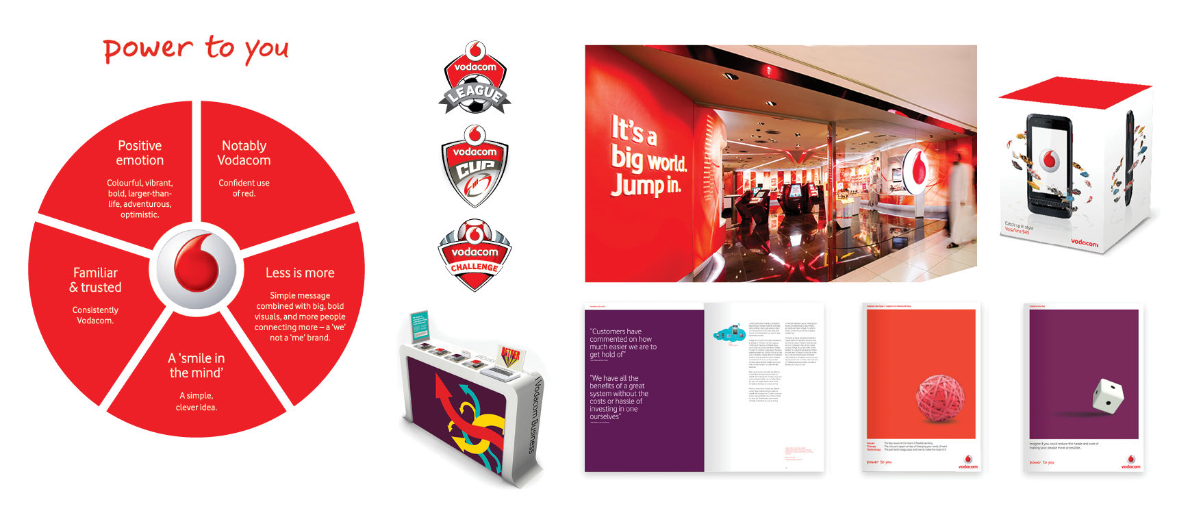
Brand principles wheel — positive emotion, notably Vodacom, less is more, a ‘smile in the mind’, familiar and trusted — beside the Vodacom League, Cup and Challenge lockups, a store window reading It’s a big world. Jump in., handset packaging, a Vodacom Business counter and brochure spreads
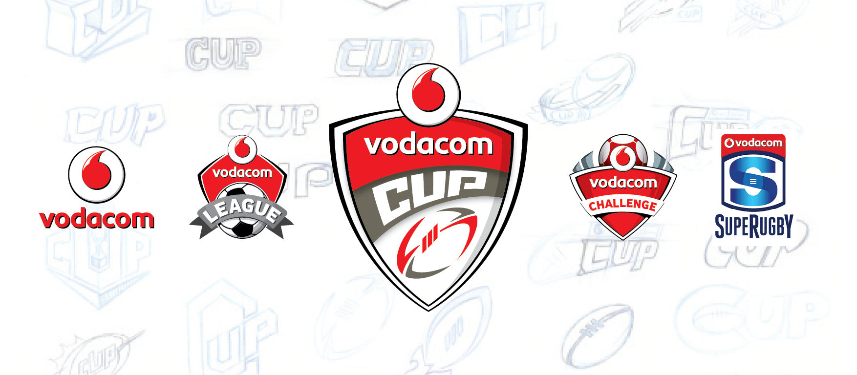
The Vodacom sports identities — League, Cup, Challenge and Super Rugby — set over pale blue construction sketches of the shield
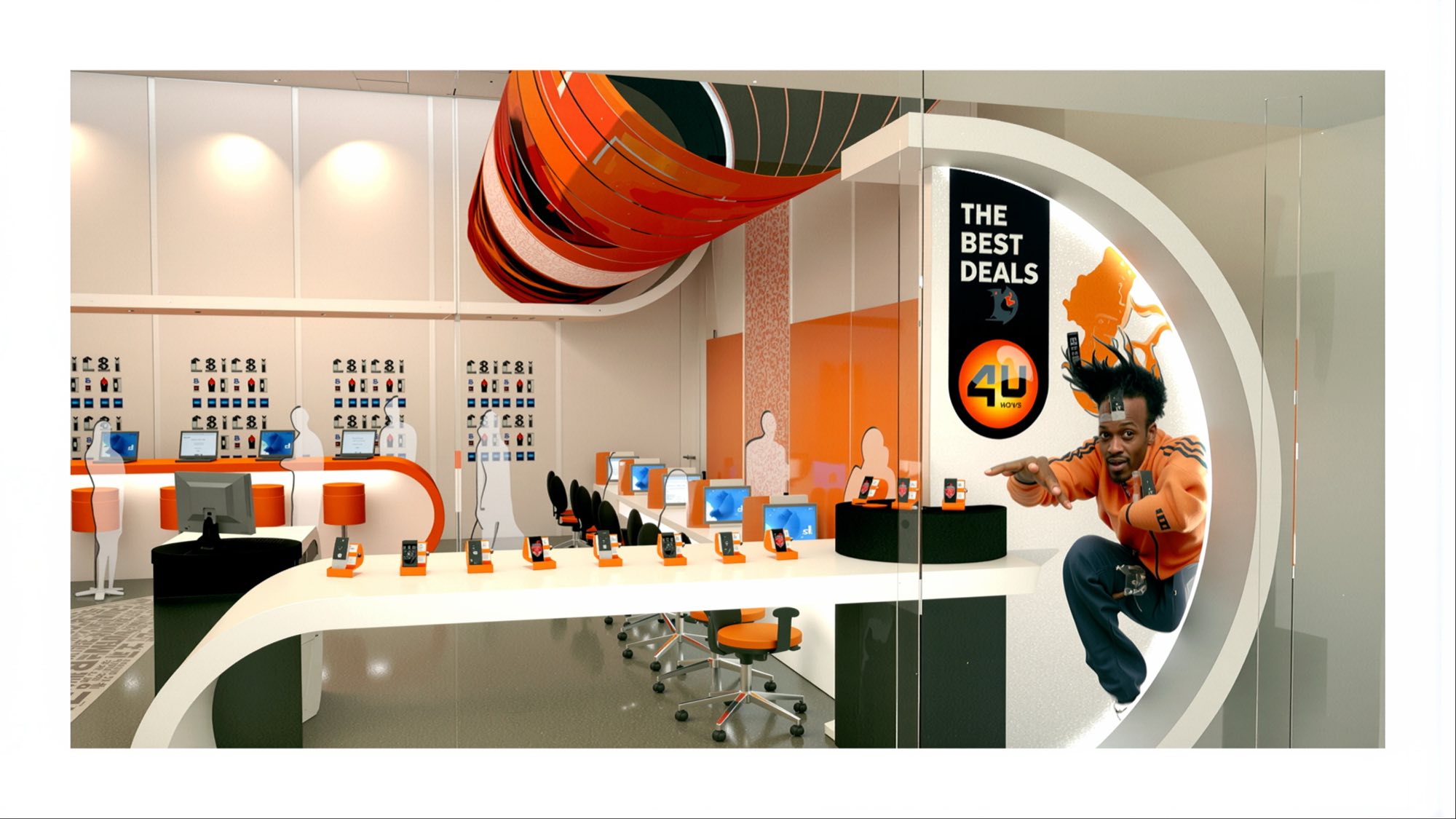
Vodacom 4U store concept: an orange and black interior with a curved handset bar, a wrapped ceiling drum, and a figure bursting from the entrance graphic beside The Best Deals
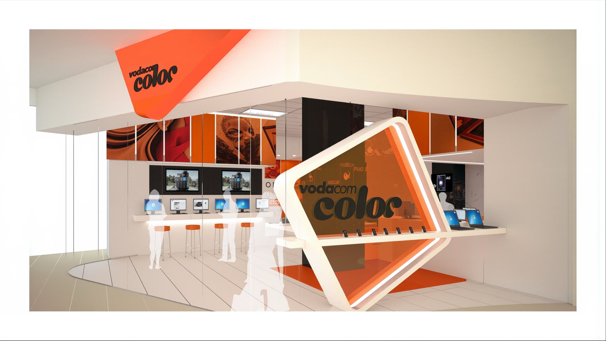
Vodacom Color store concept in orange and white, an angled illuminated frame carrying the logotype above a handset bar, with printed panels overhead