Atelier Vosloo All work

The best advice deserves exceptional service

Agency

VCCP

Sector

Fintech

Scope

Strategy Brand identity Visual language Digital

Awards

Transform Awards and Marcom Platinum Award — Brand Identity 2021 Creative Pool Corporate Identity Finalist (In book)

Live

wealthtime.co.uk

A digital wealth platform that provides excellent personal service and tech support for advisers.

VCCP has worked with Wealthtime on a brand identity that captures the platform’s people first approach. Before starting on the visual identity, VCCP worked with WT on developing brand strategy and positioning that would set it apart as the digital platform designed specifically for advisers. The team developed a brand manifesto that emphasises the platform’s role as the leading tech platform with the best service for advisers, “The best advice deserves exceptional service” and messaging that highlights the core themes of seamless, always-on access and service.

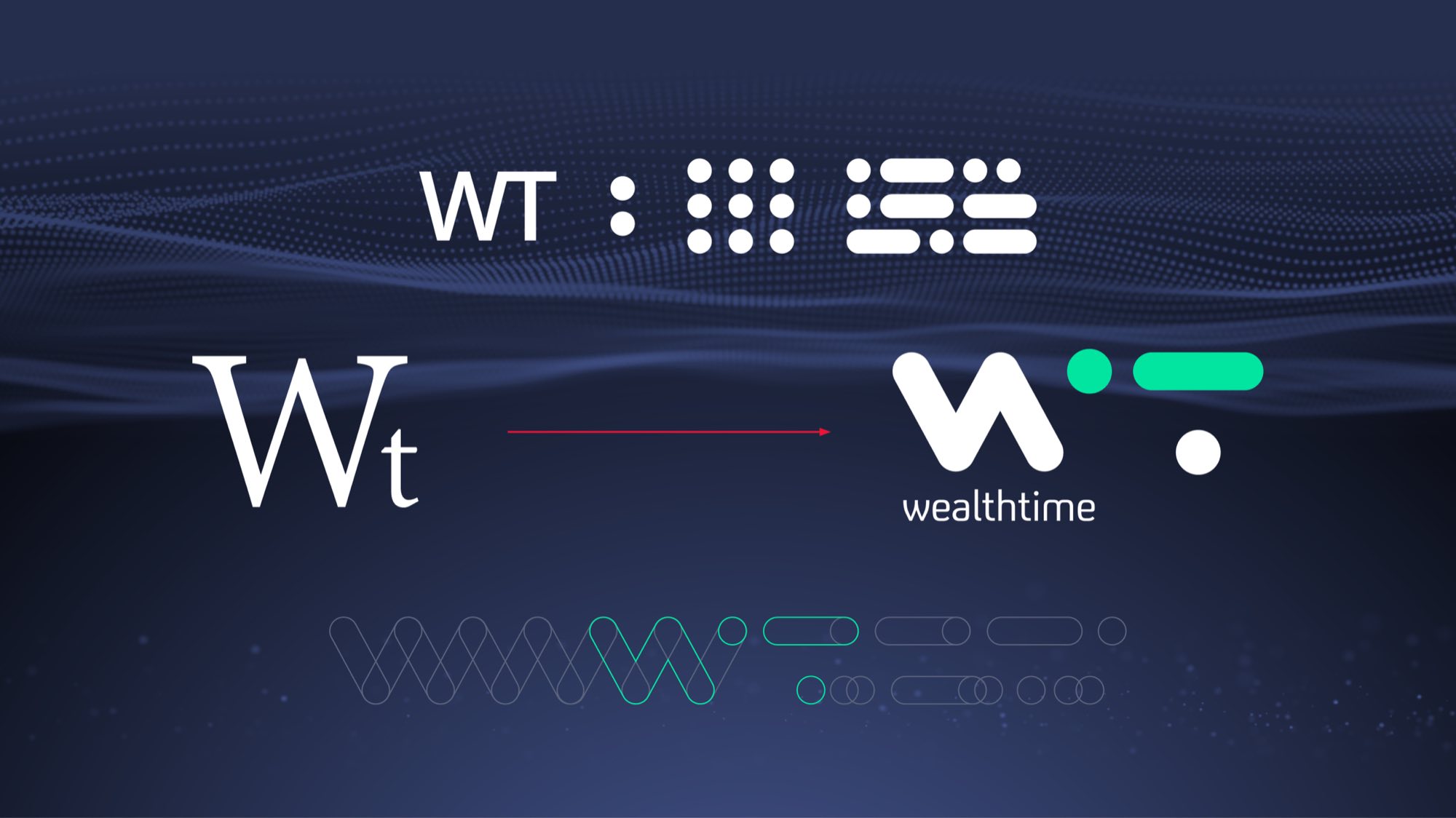
The branding is confident, modern and digital first, conveying WT’s unrivalled wealth platform expertise. Rounded data shapes are reflected in the identity, which centres on a monogram that is organic, digital and minimalist. Wealthtime’s previous logotype featured a serif monogram, a treatment that had become dated in the Fintech space.

The new identity makes use of the colon between the hours and minutes on a clock, the dots fill in the space between the stylised “w” and “t” visualising the smooth transfer of information into a monogram. Outside the logo, the dots and elongated dash of the “t” can be used to create simple graphic assets, patterns and icons that allude to the frictionless transfer of data and fluid movement of information.

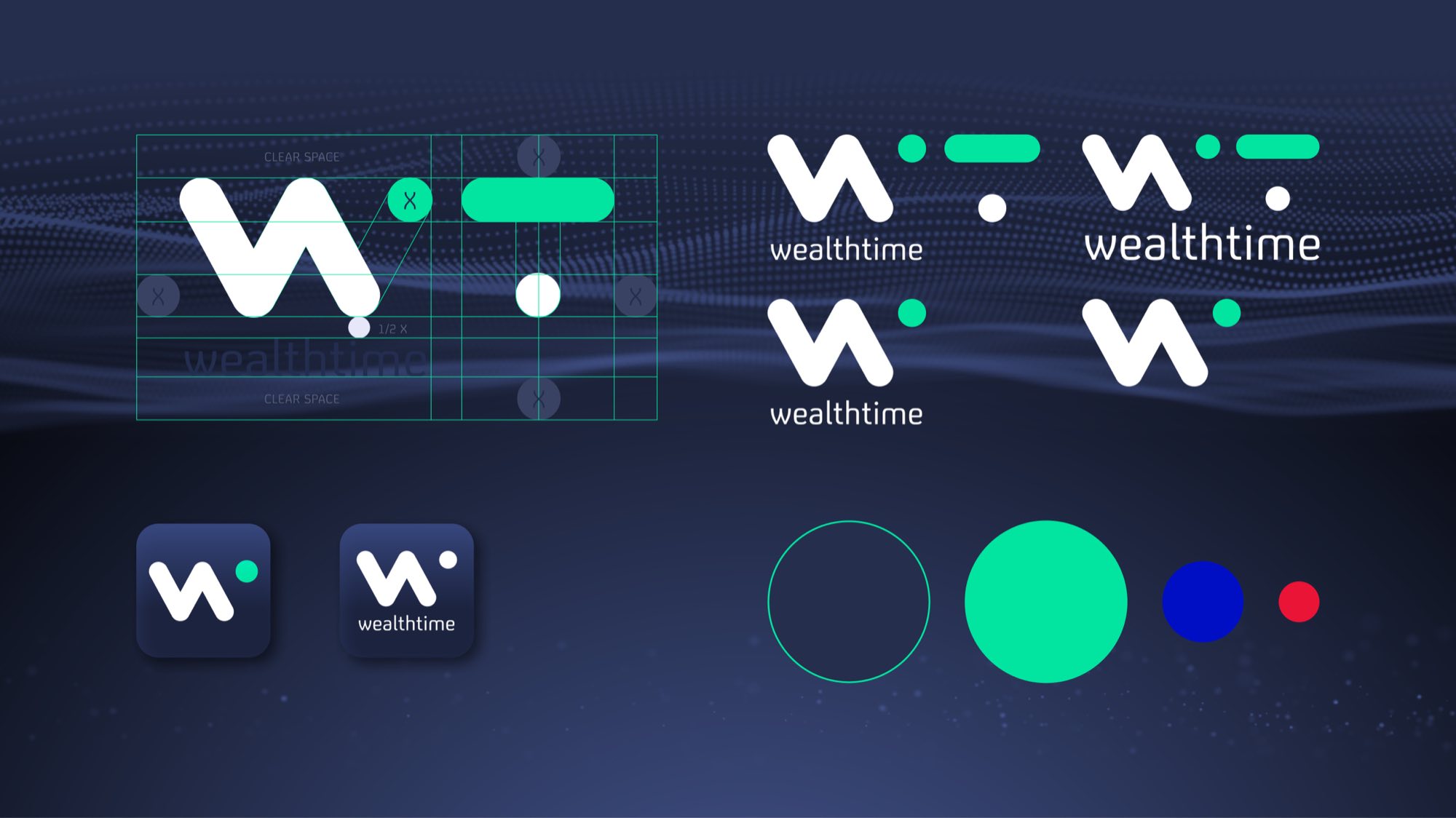
Brand typography is set in FS Untitled. The identity introduces a bright and contemporary colour palette based on the native digital colours RGB. The seafoam and electric blue move the brand beyond the standard blues ubiquitous in fintech branding.

The identity has a flexibility across an array of applications. As part of the new look, the designers developed new guidelines, a website and social assets.

Wealthtime brand film: the w mark drawing itself, the palette and type resolving, and the platform shown across screens
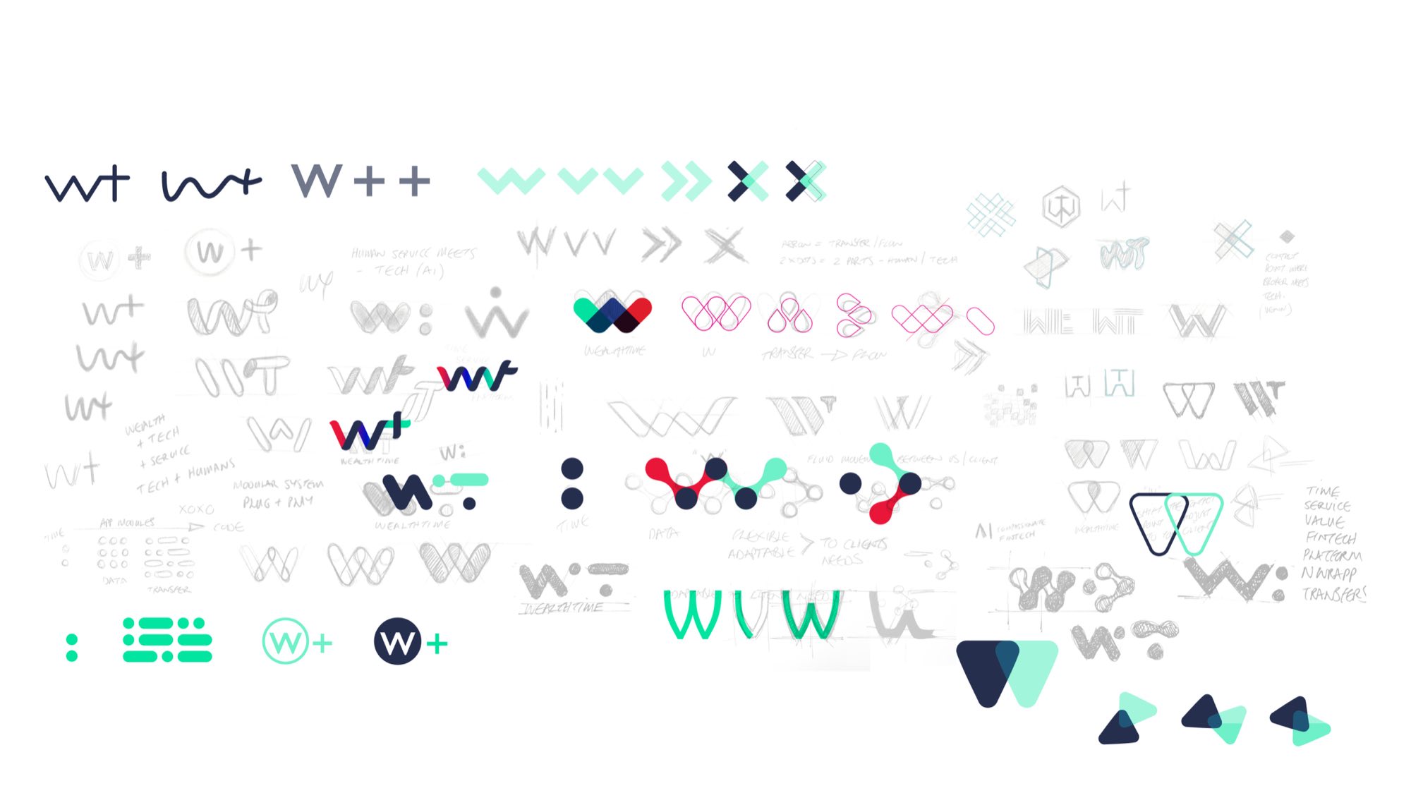
A sheet of logo exploration: dozens of routes for the Wt monogram in pencil and digital — overlapping Ws, arrows, chevrons, nodes and dot-and-bar marks, annotated with notes on transfer, flow and modular systems
Wordmark construction: the W of Wealthtime drawn in green and navy over its red outline and a light blue grid, with the brush and pencil studies it came from beneath
The rebrand on the particle wave: the old serif Wt monogram, a red arrow, and the new wealthtime mark with its green dot and bar, above the line construction and the WT, dot, grid and bar devices
The mark set out on its grid with clear space marked, beside four lockups — mark with wordmark, stacked, and mark alone — the two app icons, and the colour set as circles in green, blue and red
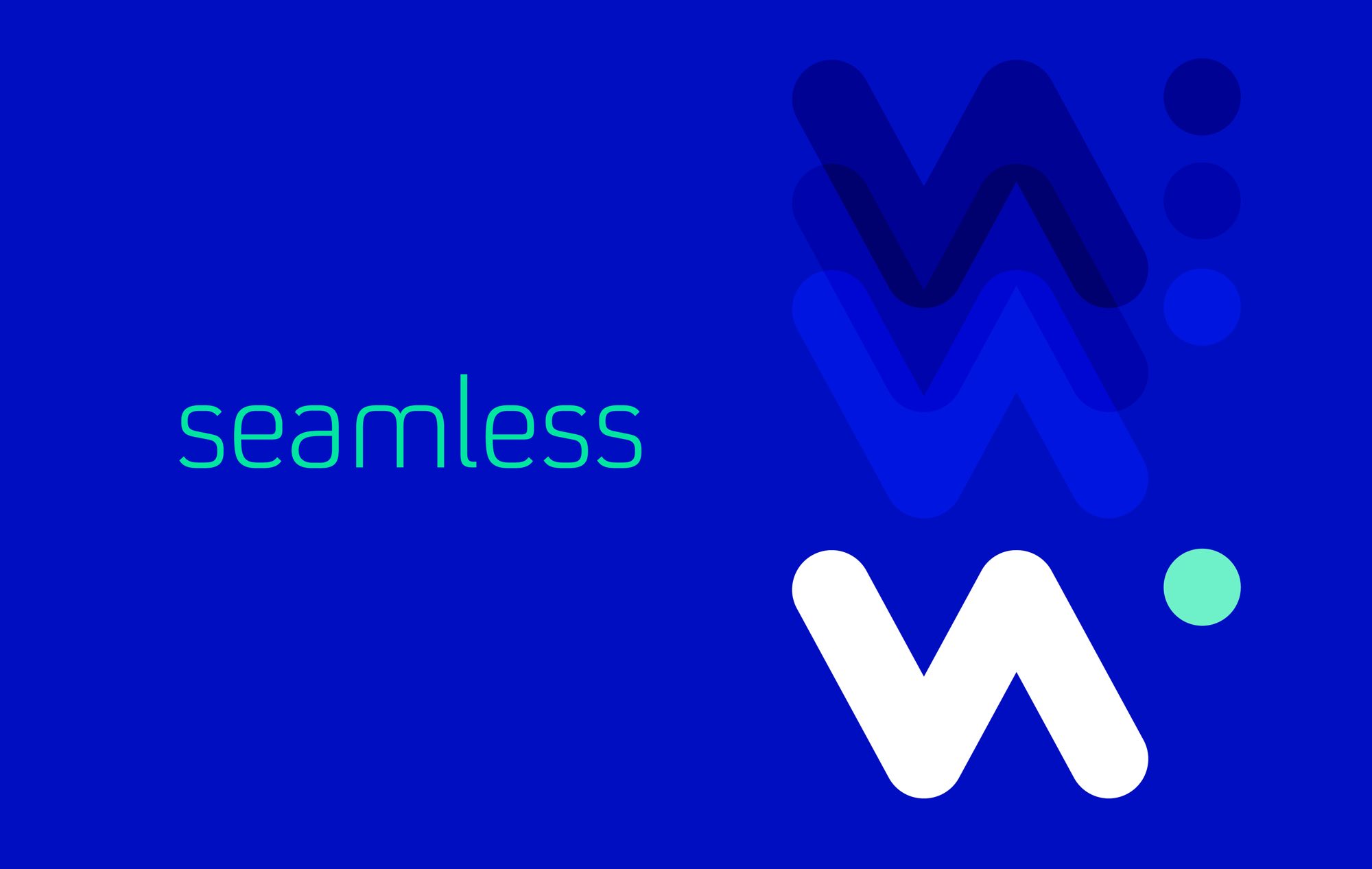
The word “seamless” in green on electric blue, beside the w mark repeated in translucent layers of blue that resolve into a solid white mark with a mint dot

We crafted a brand strategy and positioning that would set it apart as the digital platform designed specifically for advisers that captured their people first approach.

The manifesto emphasised the brand’s role as the leading tech platform with the best service for advisers.

And messaging that highlights the core themes of seamless, always-on access and service.
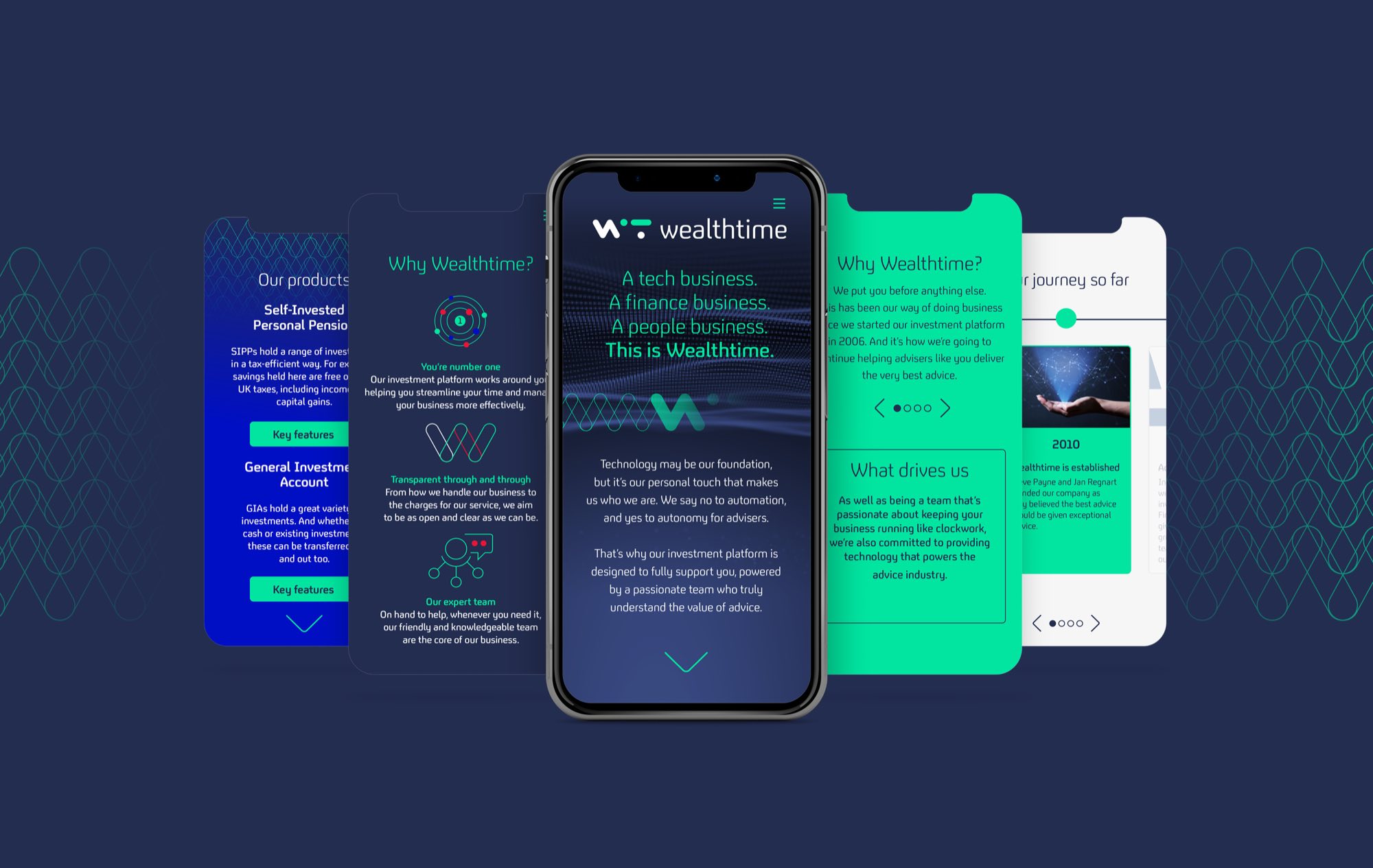
Five phone screens fanned on navy: product pages for SIPPs and General Investment Accounts, a Why Wealthtime panel with line icons, the hero reading “A tech business. A finance business. A people business. This is Wealthtime.”, and a timeline
The brand pattern: interlocking rounded columns and circles in two blues, with “seamless” and the w mark set quietly into the right-hand side
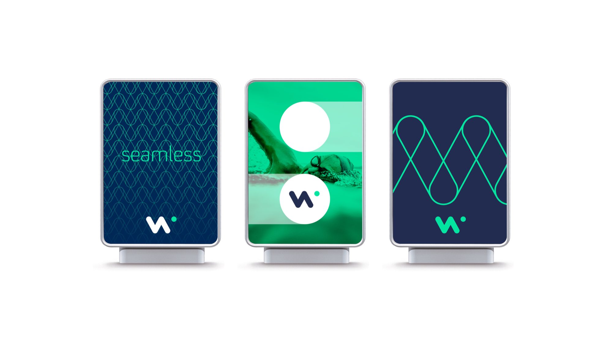
Three lightbox panels: “seamless” over the line pattern in navy, a swimmer in green with the mark in a white circle, and the zigzag pattern drawn large in green on navy
Isometric illustration of the platform in blue and green: an online document store, a data cloud of charts, a laptop reading “A tech business. A finance business. A people business.”, secure messaging padlocks, model portfolio rebalancing and an Online 24 Hours sign
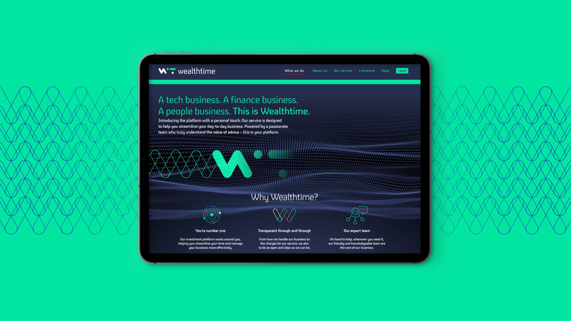
The Wealthtime site on a tablet against mint green, the hero reading “A tech business. A finance business. A people business.” over a particle wave, with the Why Wealthtime icons below
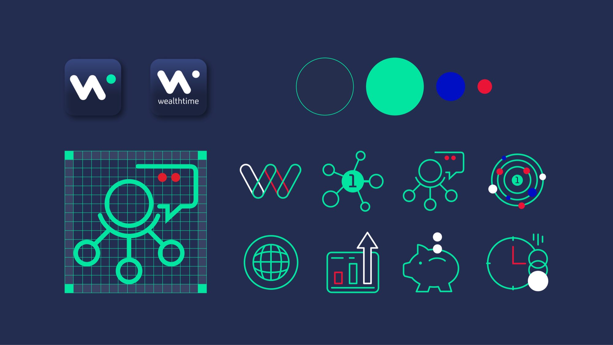
The icon system on navy: the two app icons, the colour circles, an icon drawn on its construction grid, and eight line icons — the W, a node diagram, a chat cluster, an orbit, a globe, a rising chart, a piggy bank and a clock
The Wealthtime icon set animating — line icons building stroke by stroke in green and red on navy
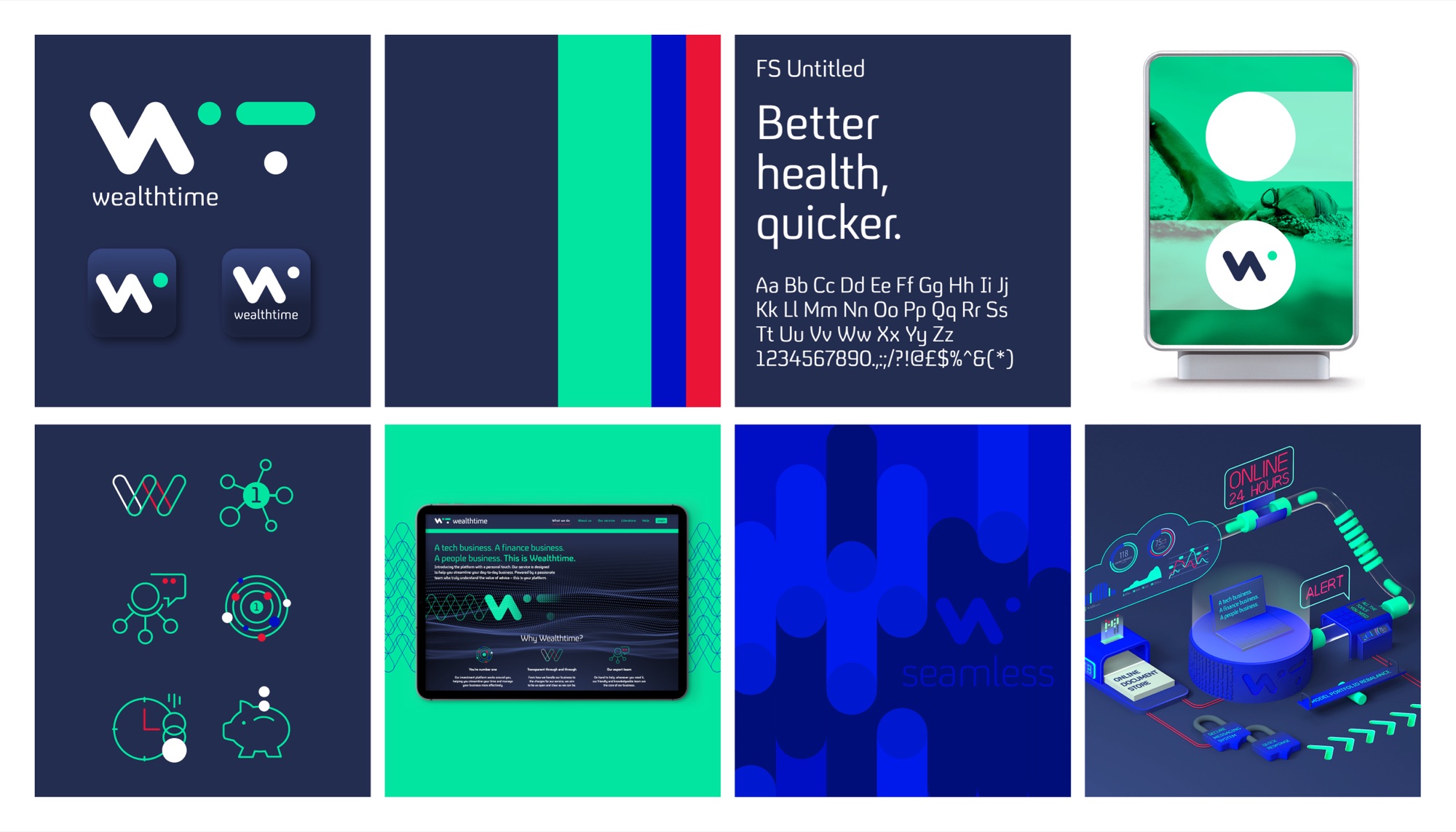
Wealthtime brand summary board: the w mark with its green dot, app icons, the navy, green, blue and red palette, an FS Untitled type specimen reading “Better health, quicker.”, a swimmer on a green-washed poster, line icons, the website on a tablet, a blue “seamless” panel and an isometric illustration of the platform